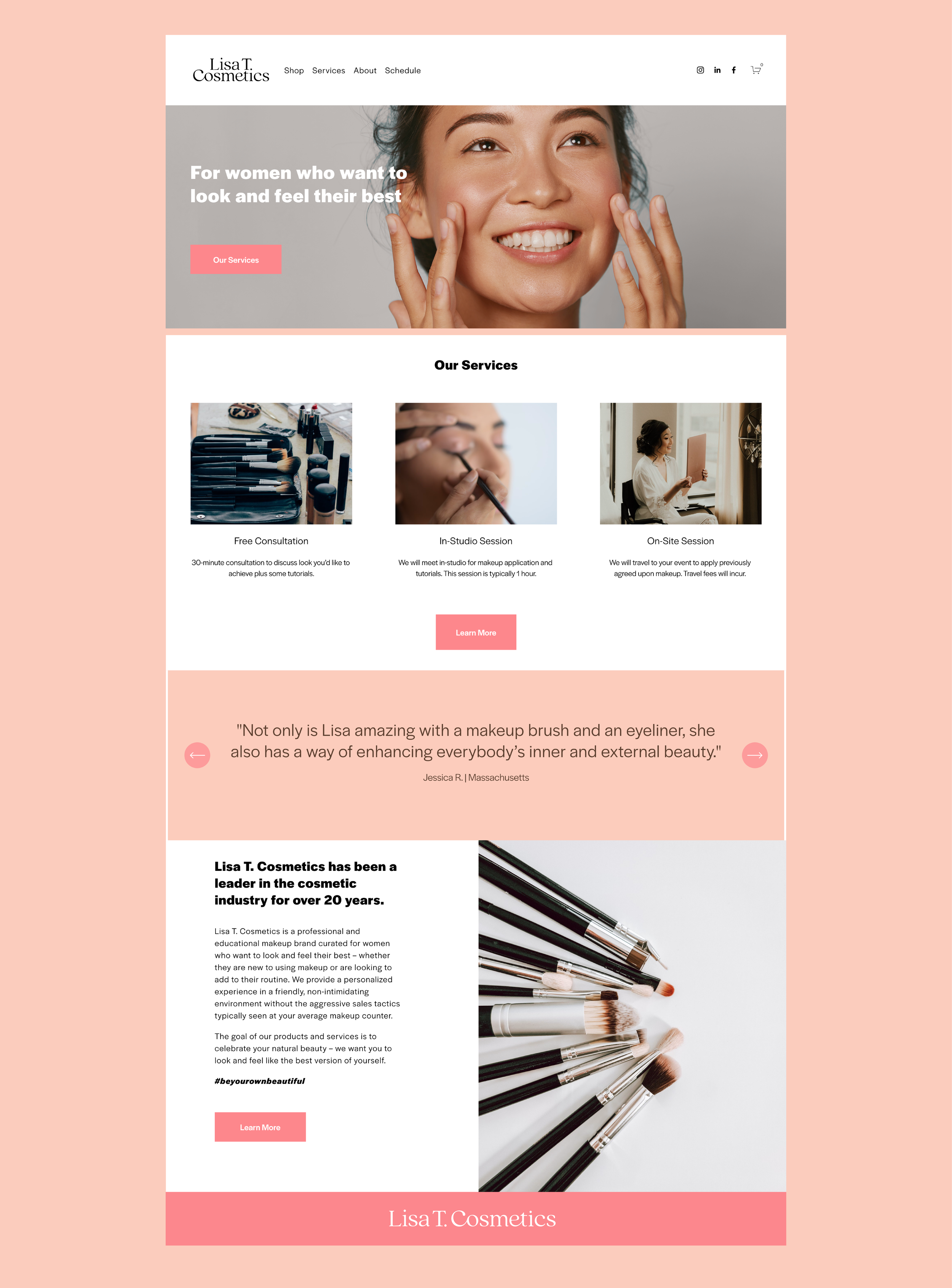
Lisa T. Cosmetics is a woman owned and operated makeup studio that focuses on helping women feel and look their best through proper makeup application. When Lisa came to me for branding and web design, she knew her current logo did not properly reflect the values or personality of her business. Lisa’s philosophy is that every woman should be educated on how the correct (even subtle) makeup application can enhance the best parts of your features and from there you can build up to the look you want. After we solidified her brand strategy, I knew I wanted to create a brand that was soft and approachable rather than edgy and ultra highend. I wanted to make sure the brand reflected her ideal client and how they would feel after a session with her - refreshed, sunkissed, and beaming.
Brand Identity Design & Strategy
- Messaging, values, & tone of voice
- Primary and secondary logos
- Logo mark
- Color Palette
- Typography
- Website design
The previous color palette was black, white and hot pink. While relevant to the cosmetic space, that palette felt more juvenile than her target audience’s average demographic. We loved the idea of using a more saturated blush and skintone shade in the updated palette to stay feminine and youthful but still appealing to all ages.
Since there was no pre-existing website, creating the site from scratch allowed us to think about how the site would flow, the customer experience, and how we wanted to incorporate the brand strategy without having to worry about updating pre-populated pages. Lisa’s main goal with the website was to have a place for her to send potential clients to learn more about her service, set up consultations, and shop for some of her best selling items. Given this is Lisa’s first site, we kept it simple with the plan to expand as we learn more about how client’s interact with the site.


