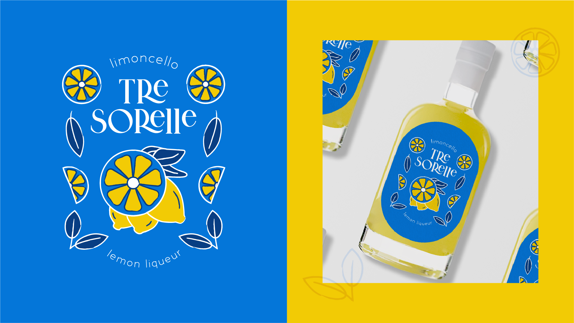
Tre Sorelle is a brand identity project inspired by that feeling of having a chilled limoncello on a hot summer day. After attending a limoncello making class with my husband, I knew I wanted to create a brand identity and label for our first batch. During my initial research into the industry, I noticed that many of the current limoncello brands out there are a bit outdated. I wanted to design something that would stand out on the shelf and include the signature colors of the Almafi Coast’s blue and white beach umbrellas as well as the bold yellow of the lemons used to make this refreshing liqueur.
Brand Identity Design
- Primary and secondary logos
- Label design
- Social Media Templates
- Color palette
- Typography
- Pattern design
Tre Sorelle (Italian for “Three Sisters”) is written in an elegant and whimsical typeface while the surround illustration is more rustic and organic, reminiscent of the lifestyle along the Italian coast. When creating a brand identity, I always try to keep scalability in mind and I love how pieces of this illustration can be utilized across assets as a pattern, spot illustration, and even as a replacement for the “O” in Sorelle.


